Showing posts with label technical. Show all posts

Friday, December 7, 2012

EoA: Line

Who would have thought that LINES could get a whole blog post of their own??  Certainly not I; that is, until today.  Lines are incredible complex, when you really think about them.  They're what I call "complex simple."

Lines are simple.  _______________  <-Line.  Blah.  Done.  But that one line can become so many things!

Thicker, thinner, dashed, hashed, messy, squiggly, straight, bold, almost transparent, double, triple, curved, angled...  Lines are what makes up the world around us.

Your house has lines, your dog has lines.  Your cat has lines, your face has lines.

They're sort of the main building blocks for creating a piece of art.  The goal of art, after all, is to share what the artists see.  Since everyone sees things differently, the world has many truths in it.


Resources:
http://www.williamsclass.com/ElectiveClassArt/ArtElementNotes.htm

Thursday, December 6, 2012

EoA: Shape

Shape is what you use when you're making the outlines of your artwork on your canvas.  Typically, it's thought of as a two dimensional aspect of art, but applied to marble or clay, it could also take on some aspects of form.

To really get your hands dirty with shape, it's best to just grab a pencil and start drawing the basic shapes you learned in kindergarten.  Circle, triangle, square.  Those shapes are kind of like the primary colors: Red, yellow, blue.  With those colors, you can make every other color.  Using just those three shapes, you can make just about every other shape, simply by varying the size, angles, "squish," and "stretch" of the shape.

Squish and stretch aren't historic art terms that you'll find in an art class, by the way.  They're mine.  :)  I think of squishing as pinching it top to bottom and stretching as pulling the shape top to bottom; or left to right, if that's the orientation you prefer!

But if you squish a circle, you get a short fat oval.  If you stretch it, you still get an oval but it's long and thin now.  Same thing goes for the other shapes.

Now comes the fun part!  Laying those shapes (squished, stretched, and made the right size) over the top of each other gives you the form of things you already know.  For instance, if you took a square and overlapped another one of the exact same size, but changed the angle a little, you'd get an octagon.  Color it red and it's a stop sign.

If you take a square and put a triangle on top of it, it looks like a house.

You manipulate the shape until it looks like the thing you're looking at!


Resources:
http://www.williamsclass.com/ElectiveClassArt/ArtElementNotes.htm

Wednesday, December 5, 2012

EoA: Form

Form is the outline of any object or set of objects.  So, if you saw something you'd normally recognize, like in this image:


You know that it's a ballet dancer, by the outline or form of the shape.  You don't know what her race is, nor do you know what color her dress is, but you know she's a ballet dancer just by her form.

Resources:
http://www.williamsclass.com/ElectiveClassArt/ArtElementNotes.htm

Tuesday, December 4, 2012

EoA: Space

This particular Element of Art refers to the emptiness or area between, around, above, below, or within objects.  Space can be both positive and negative.  If you're working with positive space, you're working with the actual forms that you intent your observer to engage with.  If you're working with negative space, you're working with the space around your main objects.

As an example, let's look at a capital letter O on a lavender background:

O

If your whole piece of art consisted of a big O, like this, on a lavender colored ATC, the black O would be positive space (or the thing you want people to look at first).  Behind and inside the O is the negative space - basically, everything that's lavender colored.

MC Escher has tons of work that's prime examples of utilizing space in inventive ways:


Resources:
http://www.williamsclass.com/ElectiveClassArt/ArtElementNotes.htm

Monday, December 3, 2012

EoA: Texture

This is one of my personal favorite aspects of art.  Texture refers to one of two things:

  1. the actual physical way a piece of art feels (hard, smooth, rough, bumpy) to the touch, with your fingers.
  2. the implied texture of a drawing.  It feels smooth to the touch, but it *looks* like it could give you the physical sensations in the same way the actual sensations do (bumpy, smooth, rough, knobby, furry).

A great example of how to use texture is found in the works of one of my favorite artists, Vincent Van Gogh.    In this painting, it looks like the bark of the tree is rough and that the leaves of the tree would probably be crispy if you touched it.  The painting uses both aspects of texture.  Van Gogh slathered on paint and it's bumpy to the physical touch, but the images invoke the sense you'd get if you could touch the real thing, too.

Van Gogh's Mulberry Tree
Detail of Mulberry Tree


Resources:
http://www.williamsclass.com/ElectiveClassArt/ArtElementNotes.htm

Friday, November 30, 2012

EoA: Value

Value is what you use when you're working with black and white.  It's the grays in between the extremes of white and black that give the idea of depth and brings out the image.  Value suggests textures, planes, and shows where light comes from.

Value includes shadows and light.  Without value, everything looks like it's flat and lacking in realism.

Compliments of  http://www.williamsclass.com/ElectiveClassArt/ArtElementNotes.htm

Resources:
http://www.williamsclass.com/ElectiveClassArt/ArtElementNotes.htm

Thursday, November 29, 2012

EoA: Color

Color permeates our daily lives.  Some people, who vividly recall their dreams, also report dreaming in color.  We use it liberally in our society now, almost to the point of taking it for granted.  (Personally, I think that's why humans worked so hard to develop fluorescent colors.)  We can get a *wide* variety of color in our art materials now, too.  As an example, Copic markers come in four sets of 72 colors.  Prismacolor markers come in a set of 156.  The monitors we look at, these days, have 32 bit color, or 16,777,216 colors!  And your HD TV?  It's got over a billion colors.  A BILLION!  That's a 1 with 9 zeros behind it!

Truly, we're spoiled with the amount of color in our lives, considering that, historically, if you had a brightly colored anything (that wasn't "natural" colors like greens, browns, and greys), you cherished it and passed it on to your kids.  Color had a big impact on what a family heirloom was and, unless you were of the elite classes, your family only had a handful of those colored items.

Basically, we're trying to bring the colors our eyes see to a tangible medium that we can pass on from generation to generation.  Can you paint fireworks, as your eyes see them, with just 156 colors?  How about 16,777,216 colors?  What about a billion colors?   Sadly, not even a high definition TV can match what our eyes see.  But that's our goal: to match and capture what our eyes see, so we can share our true perceptions of the world around us with others.

Resources:
http://www.webexhibits.org/causesofcolor/

http://www.williamsclass.com/ElectiveClassArt/ArtElementNotes.htm

Wednesday, November 28, 2012

Elements of Art


Just like a chocolate chip cookie recipe calls for a certain amounts of ingredients (like sugar, flour, baking soda, eggs, vanilla, and chocolate chips), art has things that make it "art," too.  If you're a Master Chef/Baker, you use more complex ingredients to make your signature dish (think truffles, shallots, prawns, Celtic sea salt, white pepper, and a mix of Romano/Parmesan cheeses).

Amateur artists use basic "ingredients," just like the home-baker uses the basic ingredients to make chocolate chip cookies.  Master Artists have their own "ingredients" to create their "signature dish," but the ingredients in art, however, are called elements.  The elements used in art are line, shape, form, space, texture, value and color.

There are always at least two Elements in every piece of art; even a piece that's a white board with a black line separating the piece into two halves.  That piece would be called a minimalistic art piece and it shows both line and space.  To be honest, you could even include texture in that, because there's the texture of the canvas and the texture of the medium used to make the line!  Even a dot in the middle of a canvas displays space, texture, & shape.  Honestly, I can't think of a piece of art that doesn't have at least three of those Elements.

Why are the Elements important?

It's really so you can get an idea that art is simple and easy and YOU can do it, too.  What's so hard about line, shape, form, space, texture, value, and color?  I have to say, individually, the elements aren't hard at all.

Even more than that, knowing what the elements of art are let's us:

  1. share what we think of a piece of art using language that everyone has already agreed to.
  2. gives you the tools to figure out what's going on in an artwork.
  3. lets each of us describe what an artist has done, again using those tools everyone's already agreed to use.


I found a quick video from about.com that sort of quickly hops all over these, too.

Tuesday, November 27, 2012

Depth of Field

Depth of Field is something that, generally, is applied to photographers.  However, it's interesting to look at when you apply it to master artists' work.  It's also interesting to think about for your own art and contemplate just how the eye works and what it's really seeing.


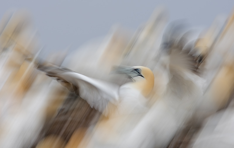
Depth of Field refers to the depth that the person looking at a scene is focusing on.  The eye is incredible, when you really think about it, because it focuses on different things in a scene so quickly that you don't really notice that you're quickly focusing on things that are very near you then very far away from you.  But if you really look at what you're seeing, you'll notice that the stuff that you're not focusing on is blurry.

It's the blur, or what is not in your focus, that I'm interested in.  For a while, it was considered "all the rage" to play with "Tilt Shift Focus" settings on some great works of art.  Wet Canvas took it a little further and explained what was really going on with the concept by applying Depth of Field concepts to it.


What I think is so interesting about Depth of Field is that photographers try to capture what the artists' eye does.  An canvas-type artist (one who works in two dimensions, or flat, but tries to create a three dimensional piece of art through the use of shading and optical illusions) puts their entire scene in focus.  There's no "blur" in a painting, just less features.  The paint doesn't actually "blur," though.  Ink and pencil work also utilizes the idea of blur, but doesn't actually blur them.

It certainly makes you wonder what a blurred painting would look like!  Perhaps that's where abstract originated from!

Monday, November 26, 2012

It's all about Perspective

Drawing in the right perspective can be tough unless you've got a "formula" or a "recipe" for how to do it.  Ever wonder how artists, architects, and engineers get a drawing to look more like real life than a drawing?   It's all about perspective.  Are you looking from a worm's view, bird's view, dog's view, mouse's view, or a human's view?  There's so many different ways to look at the world!

Image from http://www.watercolorpainting.com/perspective_1_2_3_point.htm

Generally speaking, there's three "point" perspectives:  Single, Double, and Triple.  With Single Point Perspective, you pick a point on your horizon.  All lines going up and down go up and down perfectly straight.  All the other lines, however, meet together at that one point, also in a straight line.  It's sort of strange when you're drawing it, but when it's all finished up, it looks right.  :)

Image from http://www.watercolorpainting.com/perspective_1_2_3_point.htm

Double Point Perspective follows the same idea, but you split your image in two.  So, you pick two points on the horizon you've chosen, then decide where the middle of your piece of art will be.  All horizontal lines that are on the left of the middle come together at the horizon dot on the left.  All horizon lines on the right of your image meet at the spot on the right.

Image from http://www.watercolorpainting.com/perspective_1_2_3_point.htm
Three Point Perspective is where you start getting into who's view of the world you're looking at.  Basically, the difference between Double Point and Triple Point is that the vertical lines (the ones going up and down) don't go up and down, they meet at a tertiary point.  If that point is in the sky, the point is called the zenith.  But if it's in the Earth, it's called a nadir.

Bob Ostrom, on Jerry's Artarama made a video to teach a good way to do it: Three Point Perspective.